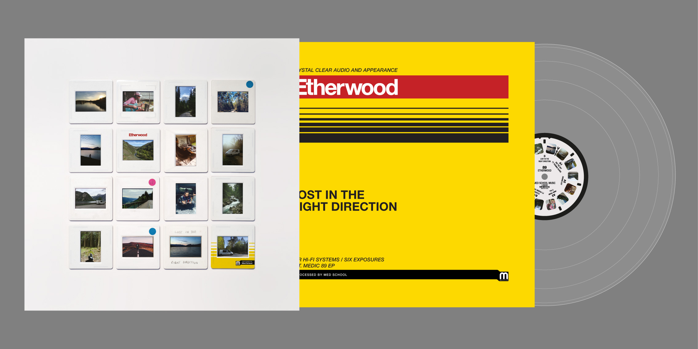
I realised recently that a lot of my favourite record covers from the past couple of years (since I last put anything on my blog here at least!) have all been very typographic. And very jumbled in their own ways too.

I’ve had a lot of fun doing these singles for Anaïs over the past few months. It’s good to break the rules sometimes and I think I’ve broken all of the ones I hold dear with these – nothing lines up, the cases are all mixed, the colours all clash, and the letterforms are all wildly inconsistent. But it does it for me!

One of Hospital’s landmark tracks, B-Complex’s Beautiful Lies, got the re-release and remix treatment. We all really liked the artwork I made for 2010’s VIP remix, but the label thought it would be nice to do this artwork in the colours of the trans pride flag for Matia on this more modern reissue. I loved the brief, but was quickly reminded how weird the letterforms of the title all fitted together in a square. Once again, my text got all wobbly and I ended up making it work with this unconventional arrangement.

This pair of covers were kind of the logical conclusion of the artwork I have been making for Degs since his debut release in 2018. I love me some Futura Bold at the best of times, and with these covers I was trying to condense the letters into as tight an arrangement as possible in the square shape of a record cover, without them completely losing legibility.

A slightly more conventional typographic collage is this single for Urbandawn. I was instructed that the title had to specifically be all lower-case, which made the collage a bit more challenging, but I like how it turned out!

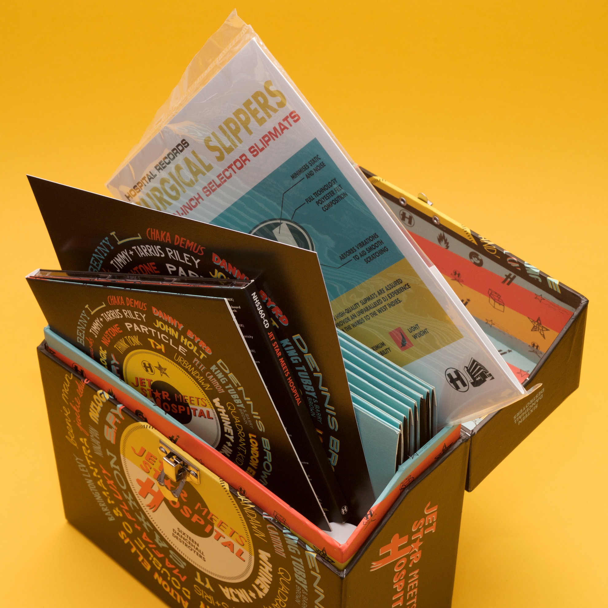
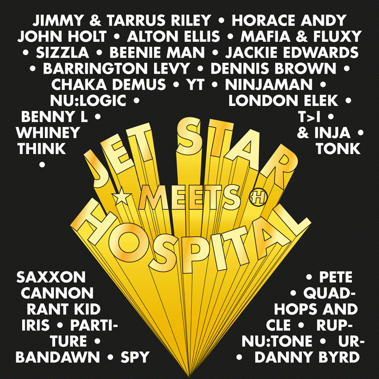
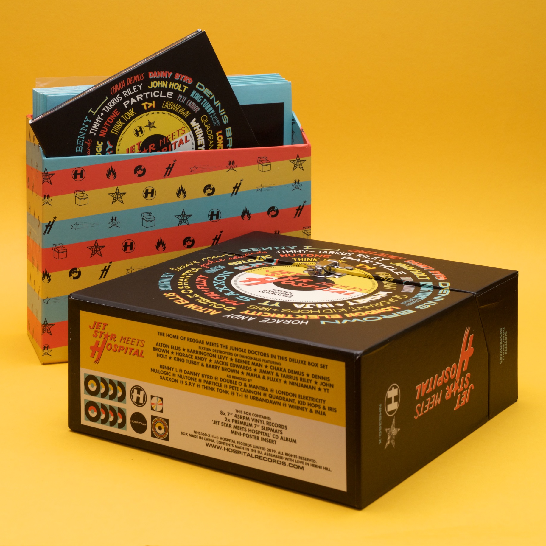
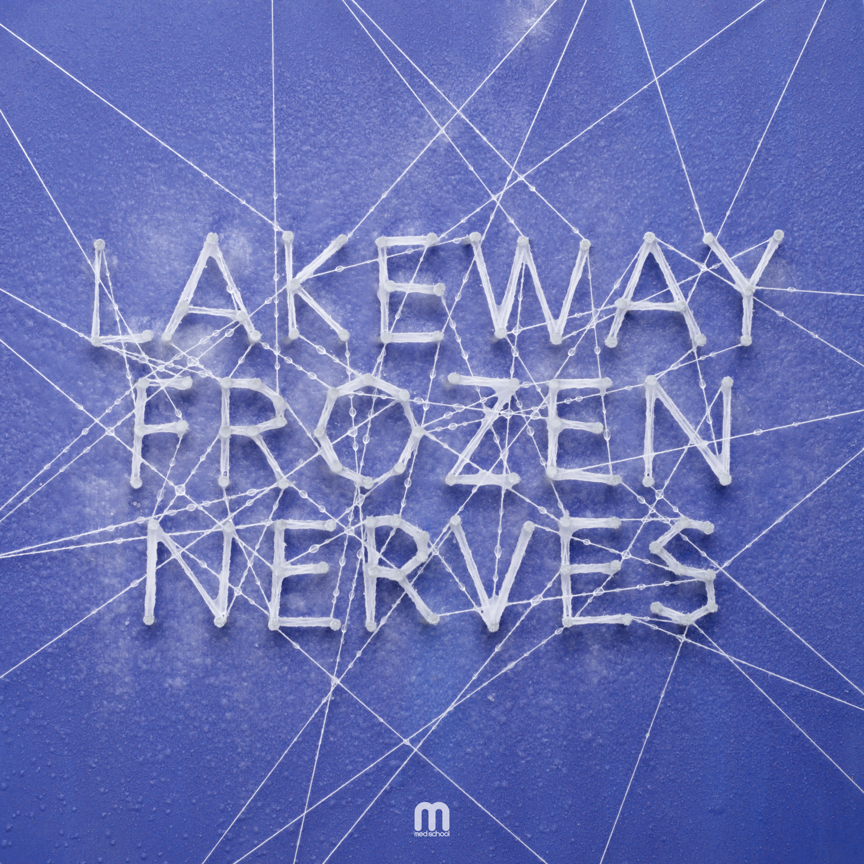
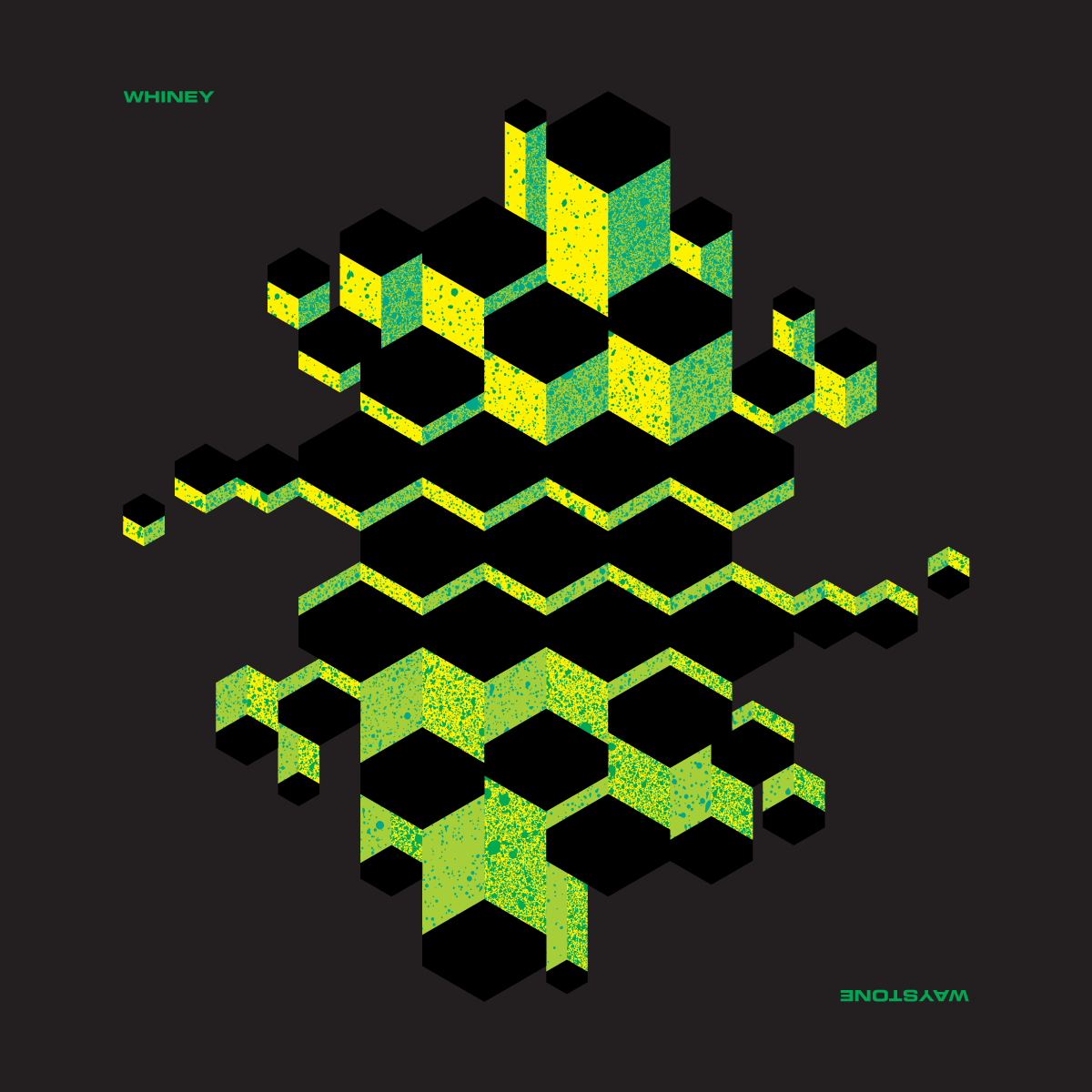
This cover was a difficult one to make work – I had a lot of names that were collaborating on this release, somehow managed to lock this up into a tight square, and even got a few typograhic easter eggs in there too.

